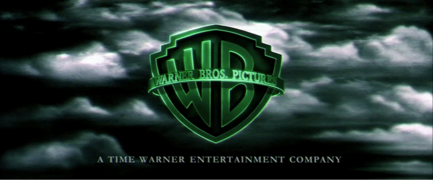
Warner Bros. Pictures
Warner Bros. have produced many films of different genres, including several thriller films, eg. Inception. Whilst the logo mostly remains the same, the company often edits their logo to reflect the genre of film that is shown.
For example, the Harry Potter logo is dark and mysterious to reflect the genre.
The Matrix version is green with more digitalised looking clouds.
Their logo reflects their company extremely well as it is very versatile and can be manipulated to suit many different genres - in turn mirroring the huge amount films this company has produced.


No comments:
Post a Comment